Branded hoarding panels are more than just a barrier around a construction site—they’re a canvas for bold, compelling visual communication that transforms your site into a marketing asset. Here’s why branded hoarding adds value:
Maximises Visibility and Awareness
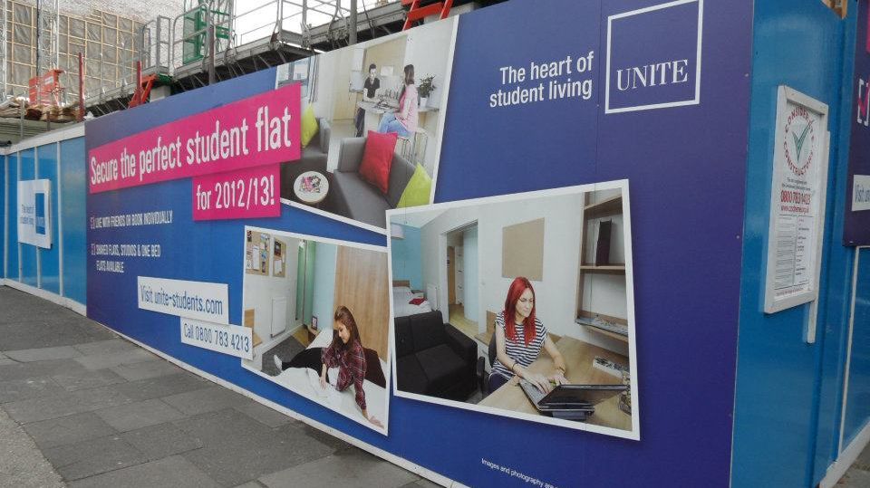
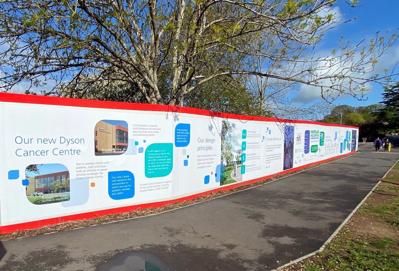
Hoardings turn idle space into high-impact advertising. Custom graphics can feature project details, architectural renders, and even promotional messages, attracting attention from passersby and generating interest in your development long before completion.
Showcases Your Brand Image
A professionally designed and installed hoarding panel exudes confidence and attention to detail. It communicates that your company prioritises quality, even down to its perimeter signage, building trust and reinforcing your reputation in the community.
Secures and Enhances Site Presentation
Beyond aesthetics, hoarding ensures site security while creating a visually pleasing perimeter. Neat, high-quality graphics signal professionalism and show a commitment to enhancing the local environment during the construction process.
Acts as a Landmark for Marketing Campaigns
Branded hoardings create a consistent, recognisable landmark that can be leveraged in multi-channel marketing campaigns, such as social media teasers, project launches, or public relations efforts, driving further engagement with your project.
In conclusion, branded hoardings are an essential investment for building contractors and property developers, adding value through brand elevation, increased visibility, and strong community engagement. By transforming construction boundaries into an advertising masterpiece, you make every inch of your development work harder for you.
At N3 Display Graphics, we love helping businesses. If you’re looking for hoarding design ideas,
get in touch with us today!
SHARE THIS POST
