The letter n is orange on a white background.

BUILDING THE MOST

POWERFUL

BRANDS.

A close up of a bright orange background.

LITERALLY.

An orange l shaped border on a white background.
A white background with a few lines on it

N3 IS A LEADING INTEGRATED LARGE FORMAT PRINT COMPANY. WITH A DIFFERENCE.

N3 brings to every client an unrivalled understanding of how to combine the physical and digital worlds to ensure a brand appears as powerful through display as any other medium. Find out more


An orange l shaped border on a white background.

OUR

WORK

A close up of a white background with a plain texture.

  • A long hallway with a lot of pictures on the wall.
  • VIEW MORE

    SERVICES

    A close up of a white background with a plain texture.

    An orange circle with black dots around it on a white background.

    PRODUCT AREAS

    A close up of a white background with a plain texture.

    An orange circle with black dots around it on a white background.

    SECTORS

    A close up of a white background with a plain texture.

    An orange circle with black dots around it on a white background.

    LATEST

    NEWS

    A close up of a bright orange background.
    by N3 Display Graphics 12 Nov, 2024
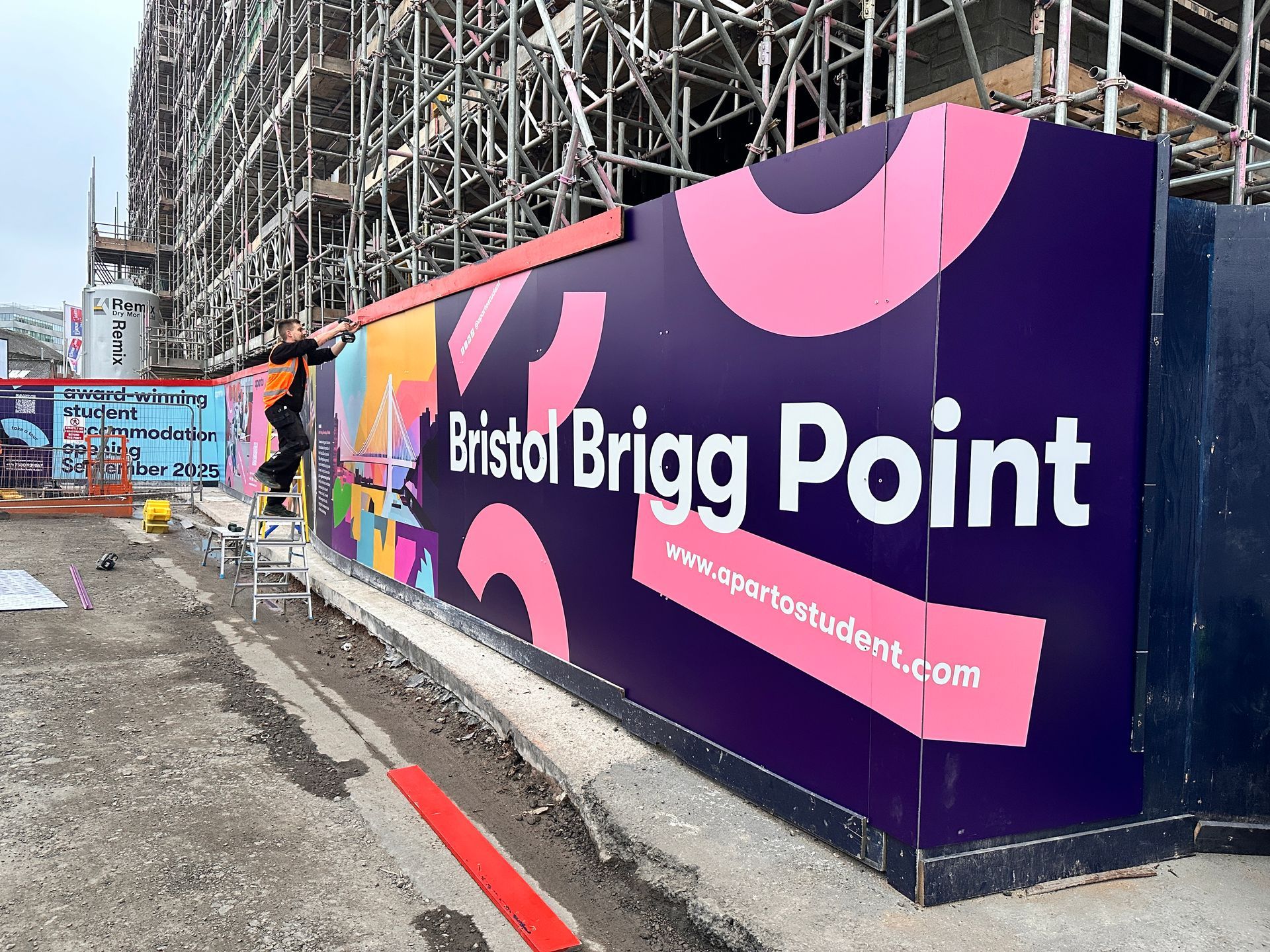
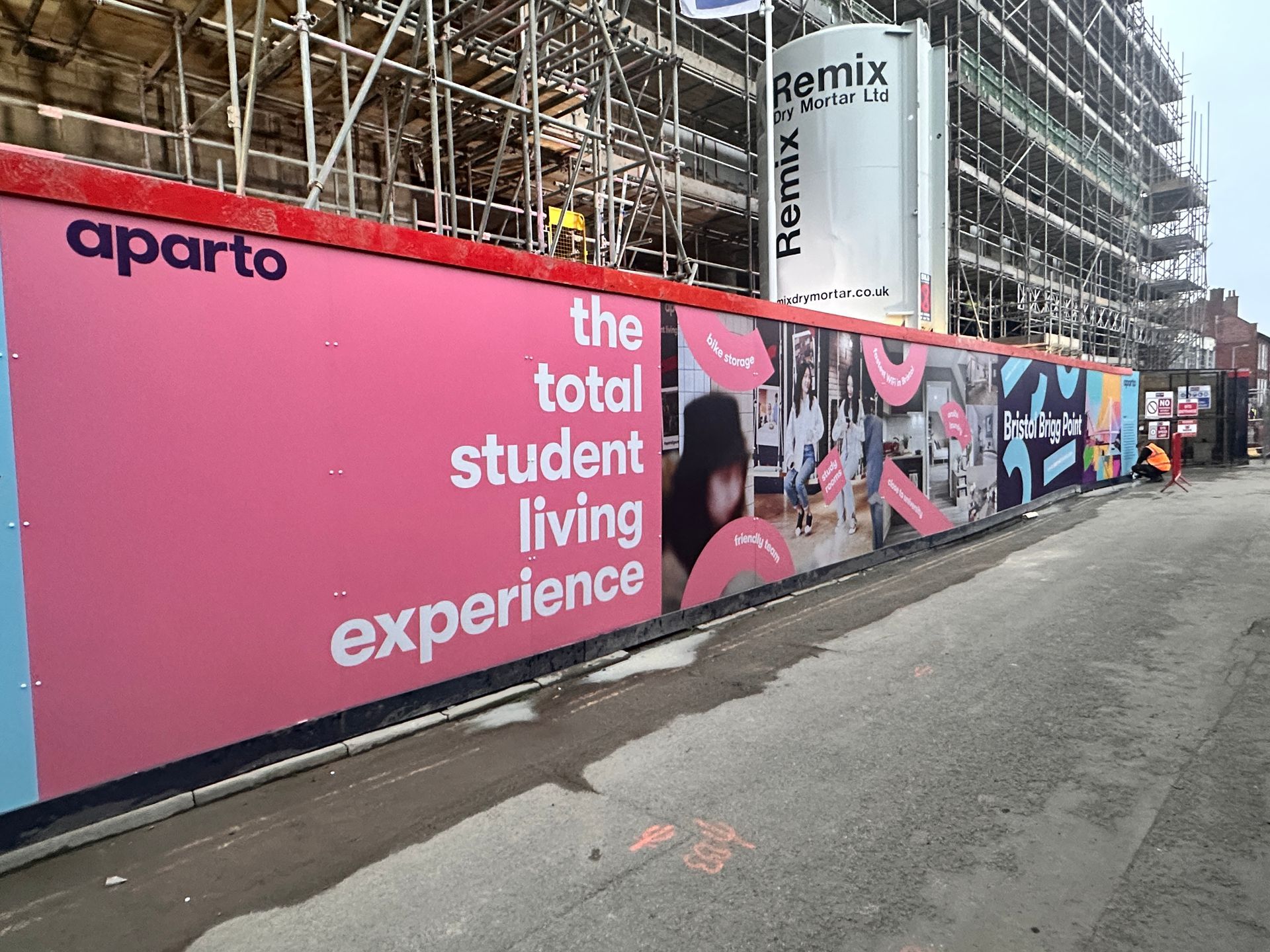
    Branded hoarding panels are more than just a barrier around a construction site—they’re a canvas for bold, compelling visual communication that transforms your site into a marketing asset. Here’s why branded hoarding adds value: Maximises Visibility and Awareness Hoardings turn idle space into high-impact advertising. Custom graphics can feature project details, architectural renders, and even promotional messages, attracting attention from passersby and generating interest in your development long before completion.
    by David Dixon 03 Oct, 2024
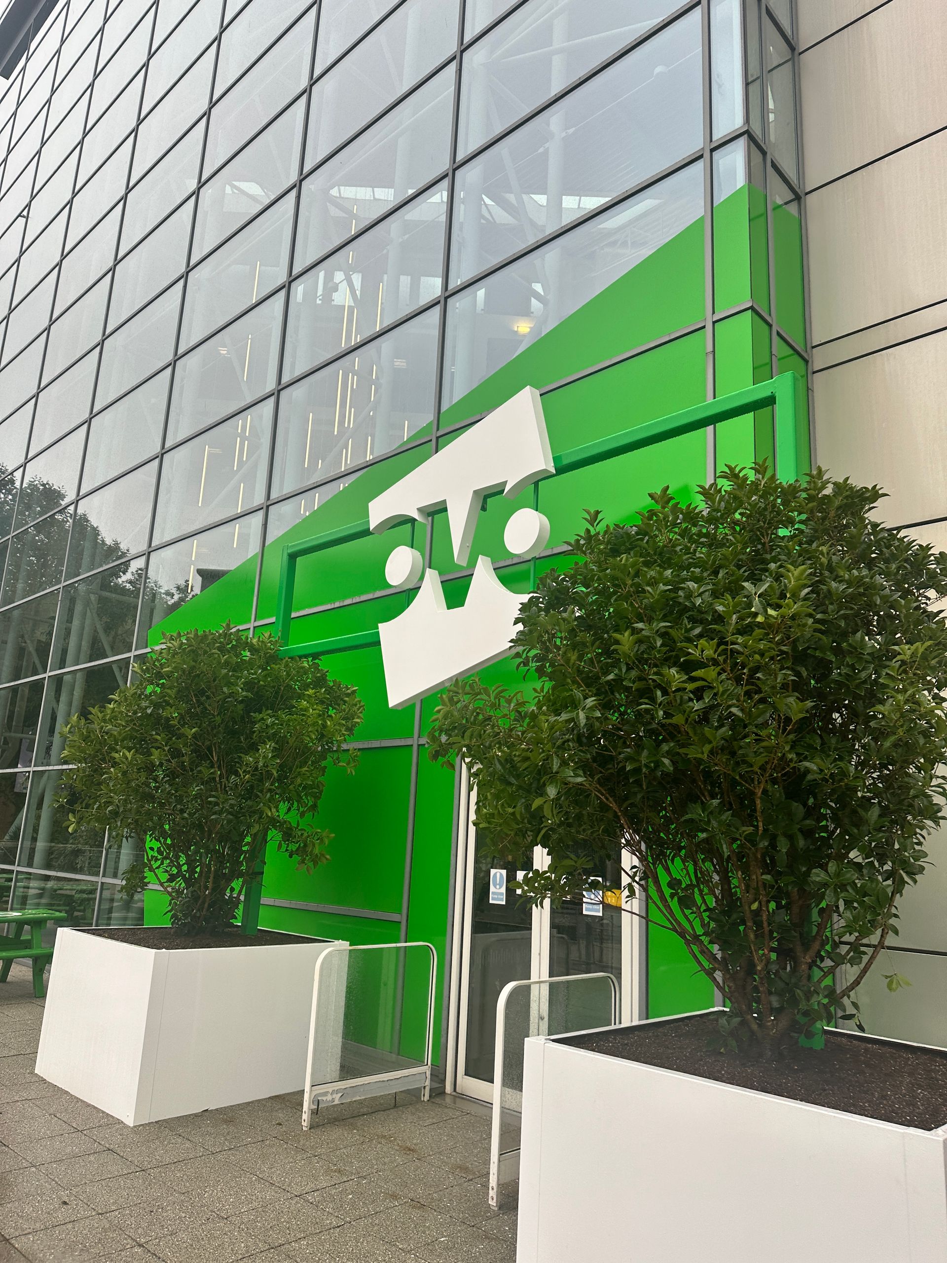
    We’re excited to share our recent collaboration with Ovo Energy, where we transformed their Bristol headquarters with a sustainable brand refresh. This project blended bold design with eco-friendly materials to reflect Ovo’s commitment to the environment. Striking Exterior and Eco-Friendly Interiors The refresh begins at the entrance, where vibrant green vinyl gives the windows a fresh, bold look. The existing Ovo logo was re-coated in white, creating a welcoming focal point at the reception that reinforces their brand identity and environmental values. Inside, we incorporated printed plywood panels, locally sourced vinyl, and acrylics to create engaging, sustainable design elements throughout the office. Custom logos and lettering crafted from routed and painted plywood added a bespoke, high-quality finish.
    by David Dixon 24 Jul, 2024
    The Art of Marketing Outside: Transform Your Outdoor Space
    Share by: