The letter n is orange on a white background.
Bespoke Showroom Signage
David Dixon • 3 July 2023

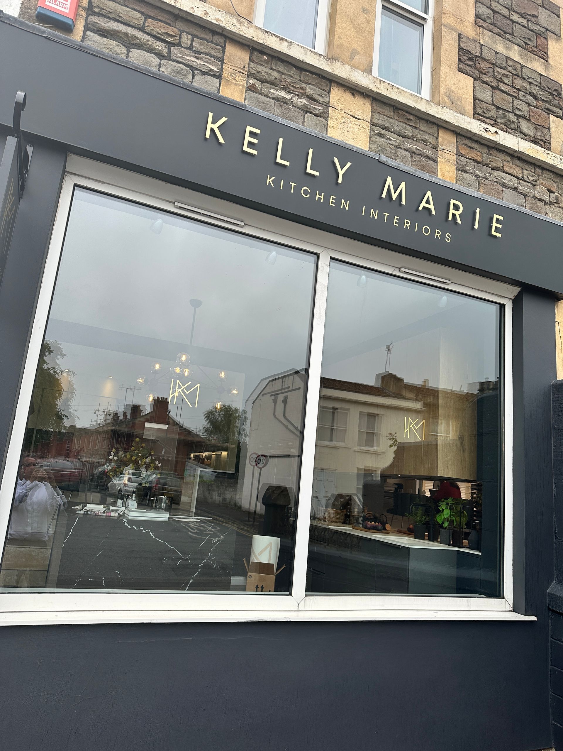
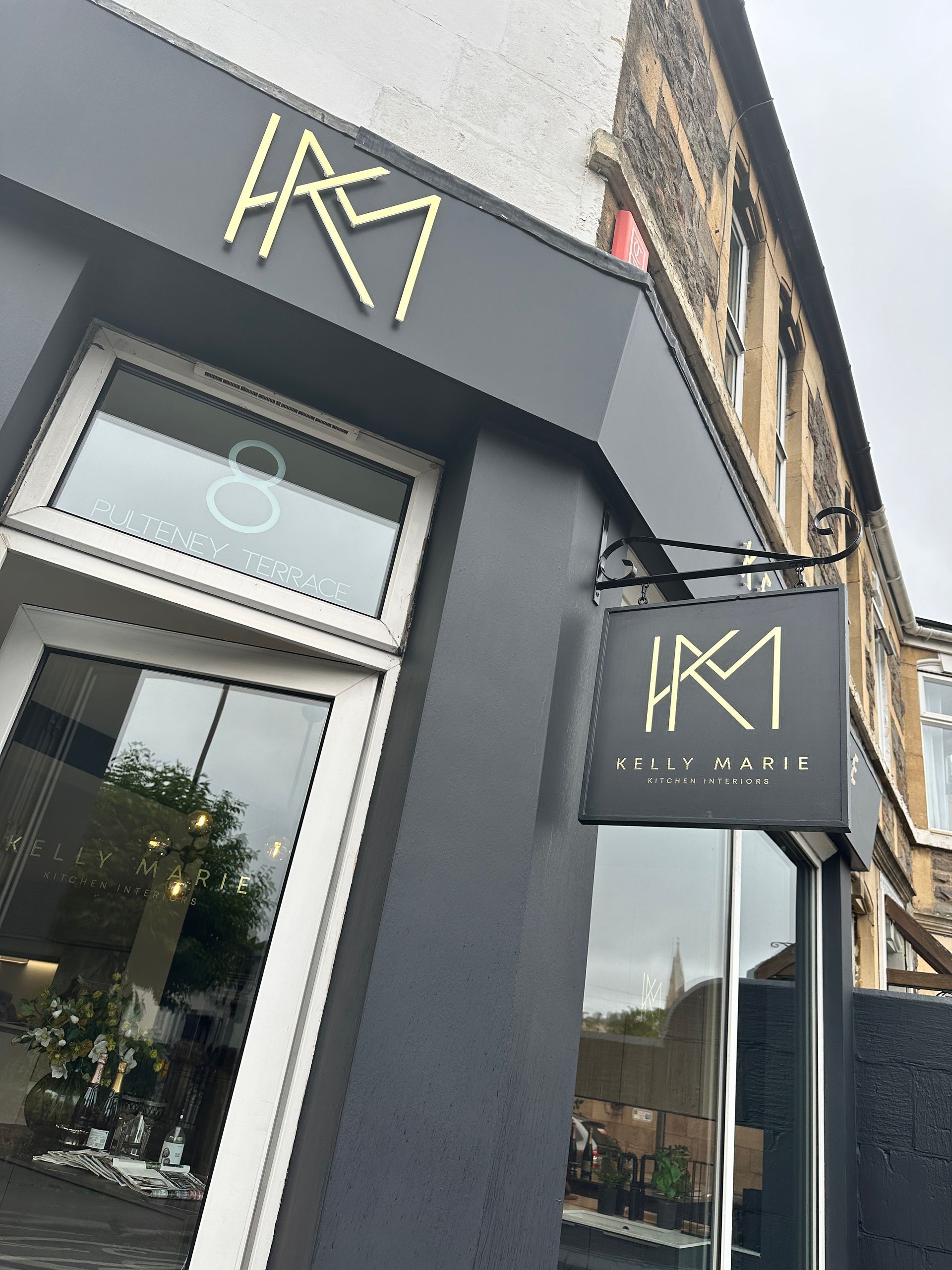
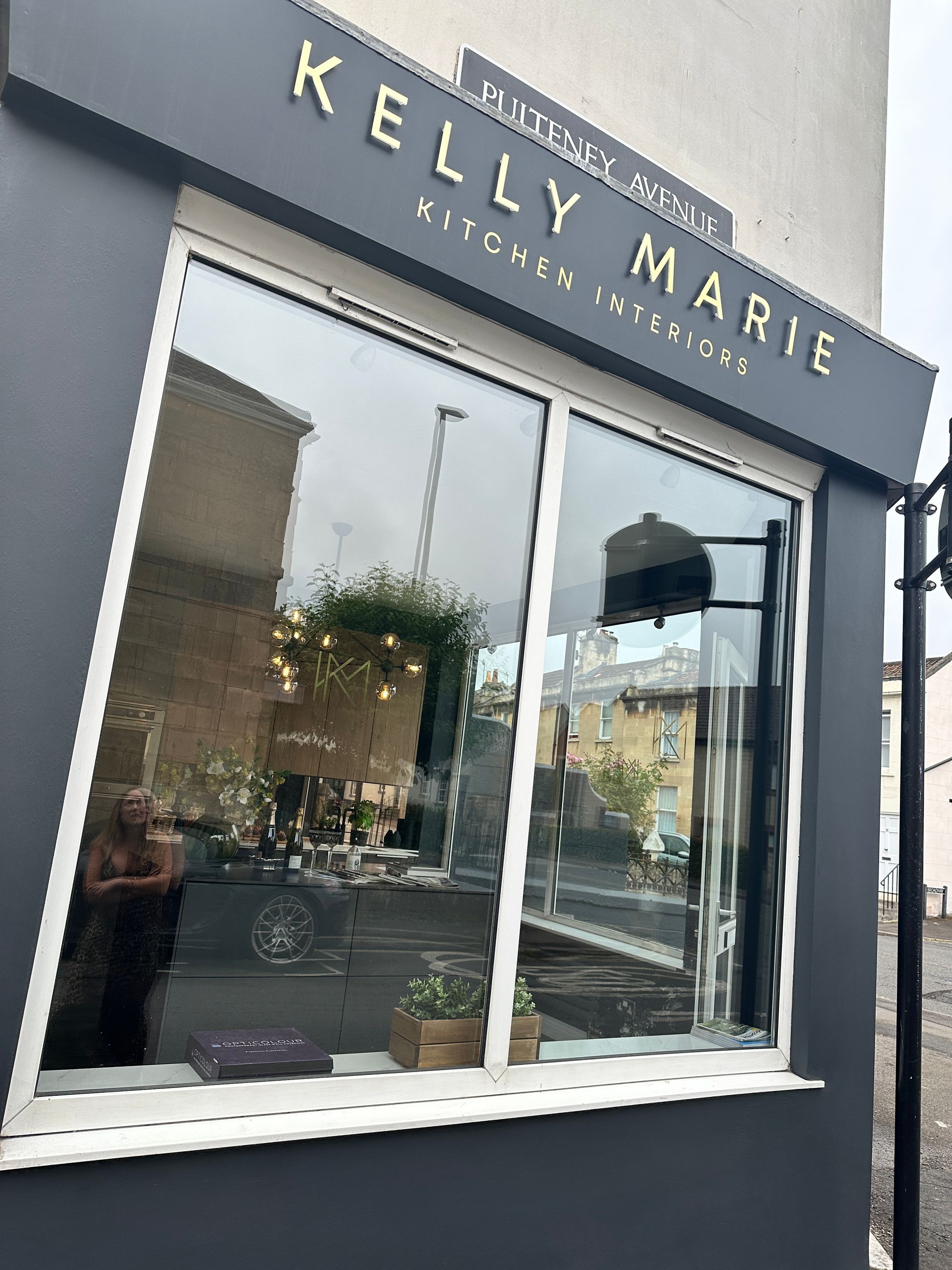
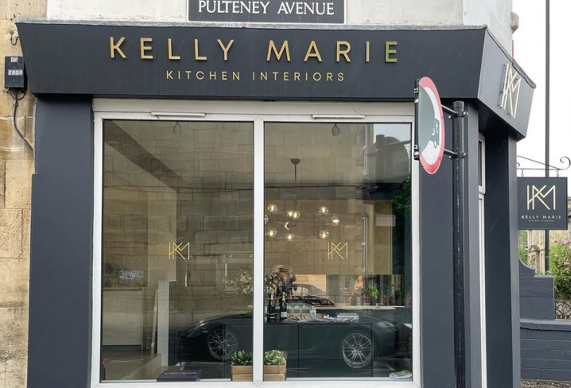
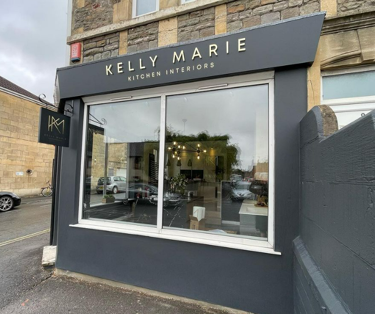
N3 Display Graphics is thrilled to unveil the stunning new shopfront rebrand we’ve completed for Kelly Marie Kitchen Interiors!
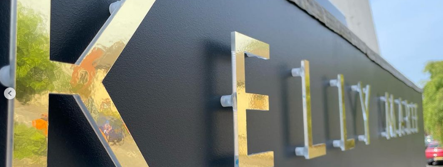
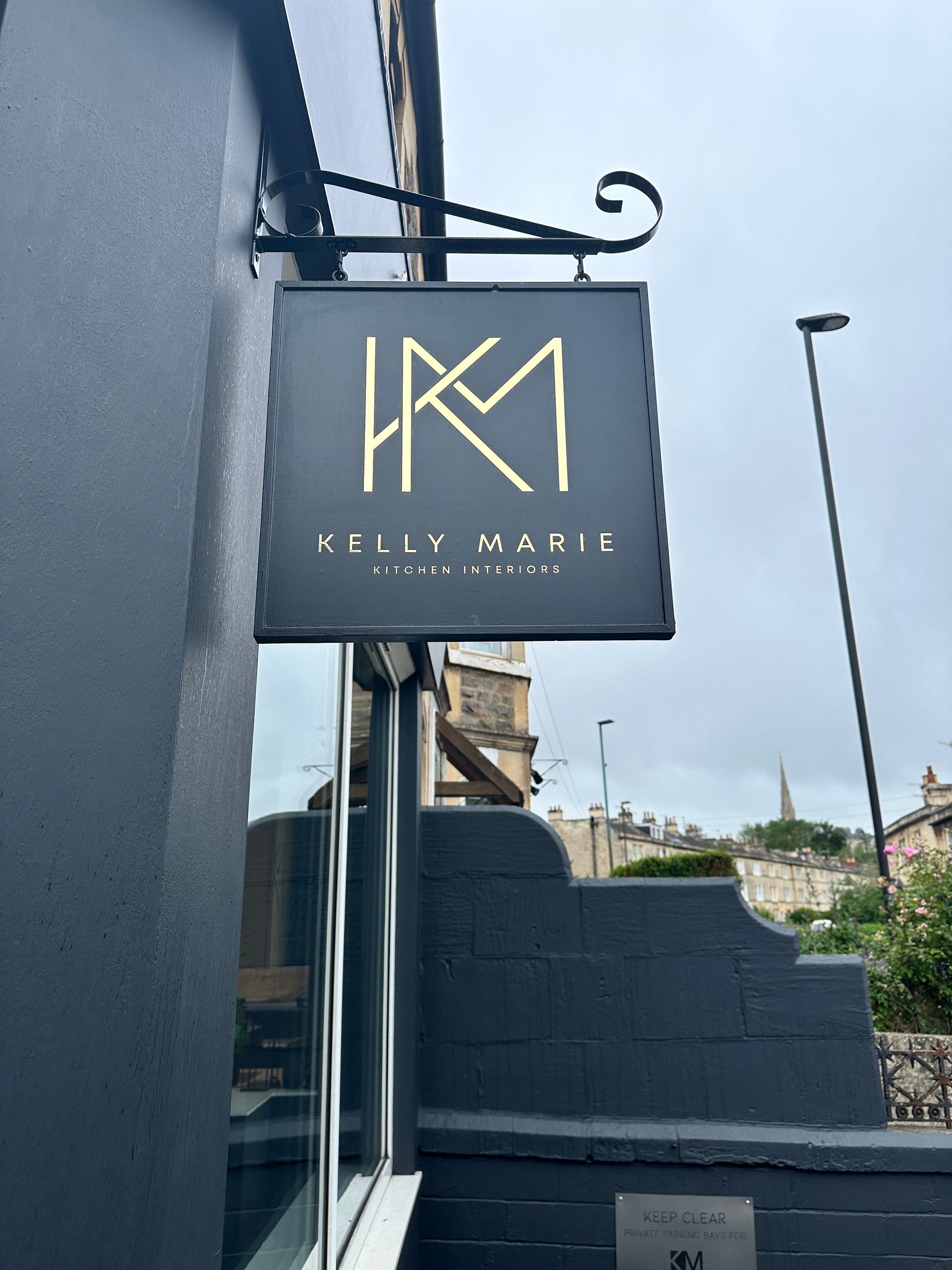
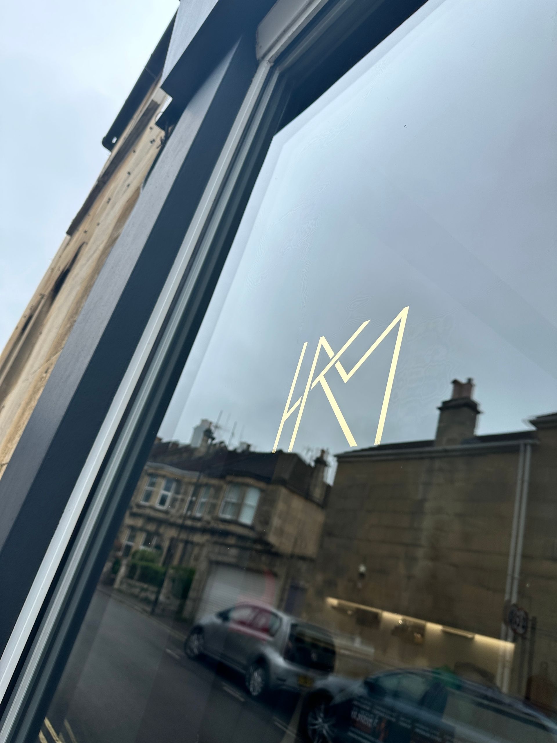
We’ve replaced her old fascia boards and transformed them with a fresh coat of her chosen Farrow and Ball colour. Adding a touch of elegance, we applied gold vinyl lettering and stand-off acrylic lettering with a gold vinyl finish. The result is a captivating shopfront that truly captures the essence of Kelly Marie Kitchen Interiors.
 
This rebrand marks a significant milestone as
Kelly Marie Kitchen Interiors celebrates their five-year business anniversary. We’re honoured to have played a part. Kelly Marie Kitchen Interiors believes in creating a space that goes beyond being a kitchen, transforming it into a vibrant lifestyle hub for cooking, dining, relaxing, and living.
 
At N3 Display Graphics, we take pride in our ability to activate a company’s new brand in exciting and interesting ways, especially when it comes to enhancing kerb appeal for those all-important shopfronts. Our team of experts are dedicated to creating visually stunning displays that captivate and engage customers.
 
If you’re looking to elevate your brand’s visibility and make a lasting impression, contact us today. We can’t wait to help bring your vision to life!

SHARE THIS POST
by David Dixon 13 March 2025
Our new 2025 Display Handbook is available now.
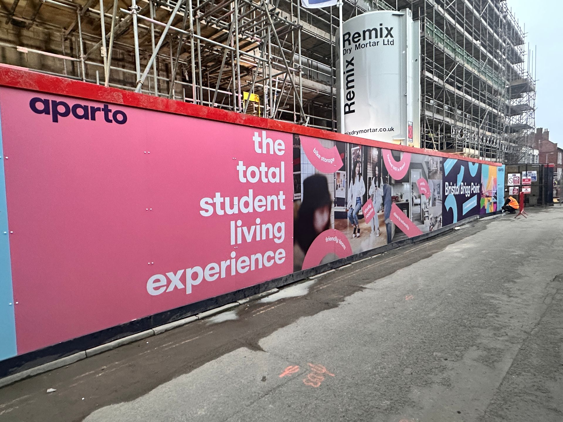
N3 Display Graphics | A construction site with a sign that says the total student living experience
by N3 Display Graphics 12 November 2024
Branded hoarding panels are more than just a barrier around a construction site—they’re a canvas for bold, compelling visual communication that transforms your site into a marketing asset. Here’s why branded hoarding adds value: Maximises Visibility and Awareness Hoardings turn idle space into high-impact advertising. Custom graphics can feature project details, architectural renders, and even promotional messages, attracting attention from passersby and generating interest in your development long before completion.
by David Dixon 3 October 2024
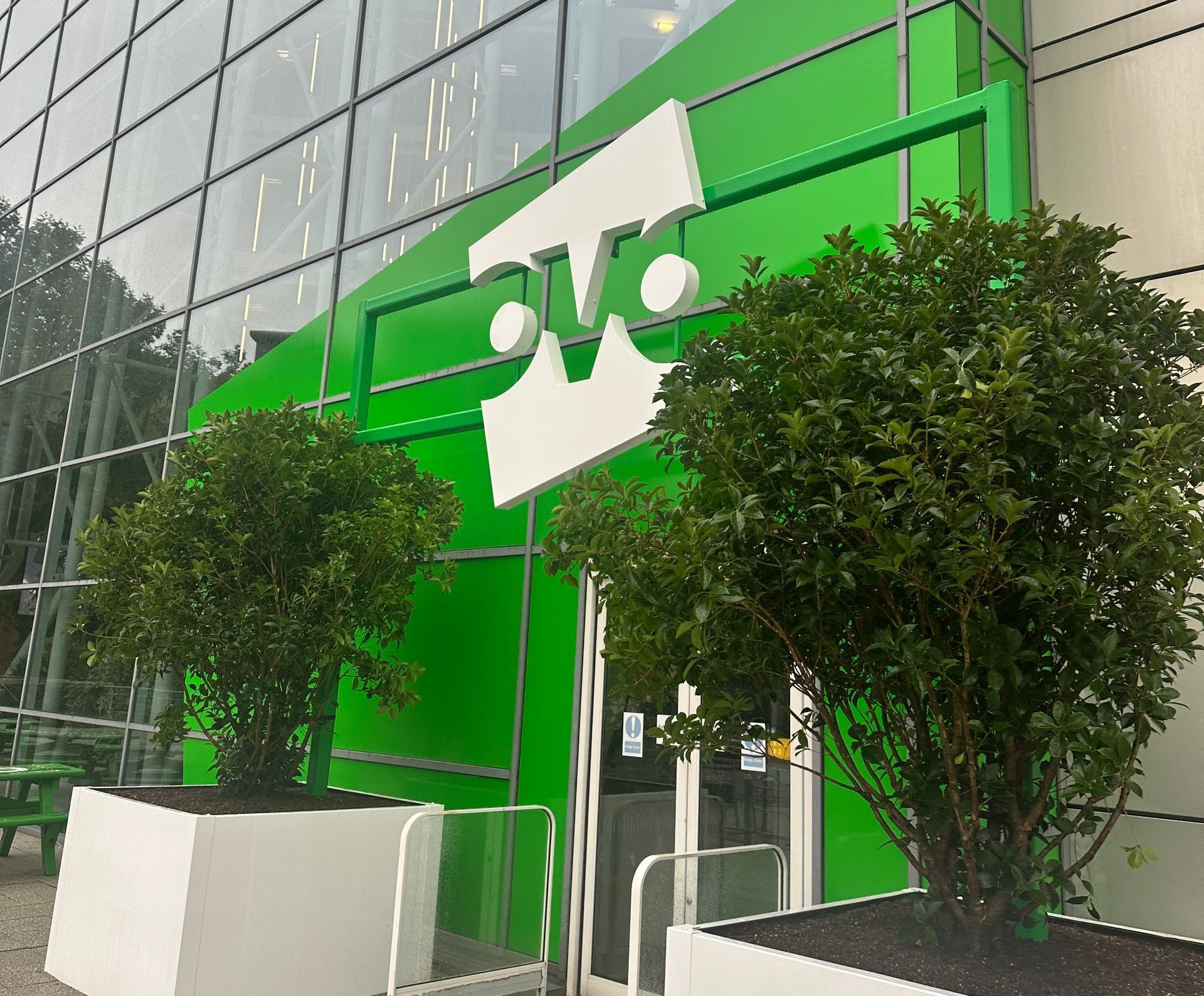
We’re excited to share our recent collaboration with Ovo Energy, where we transformed their Bristol headquarters with a sustainable brand refresh. This project blended bold design with eco-friendly materials to reflect Ovo’s commitment to the environment. Striking Exterior and Eco-Friendly Interiors The refresh begins at the entrance, where vibrant green vinyl gives the windows a fresh, bold look. The existing Ovo logo was re-coated in white, creating a welcoming focal point at the reception that reinforces their brand identity and environmental values. Inside, we incorporated printed plywood panels, locally sourced vinyl, and acrylics to create engaging, sustainable design elements throughout the office. Custom logos and lettering crafted from routed and painted plywood added a bespoke, high-quality finish.
Share by: