The letter n is orange on a white background.
Rebranding a "MUGA" for Bath Recreation Limited
David Dixon • 14 June 2023

We're excited to have completed this neat branding exercise for Bath Recreation Limited.


The Power of Teamwork

It's fantastic to witness the power of teamwork from various organisations in Bath, all working towards a common goal: enhancing sport and physical activity in our community.


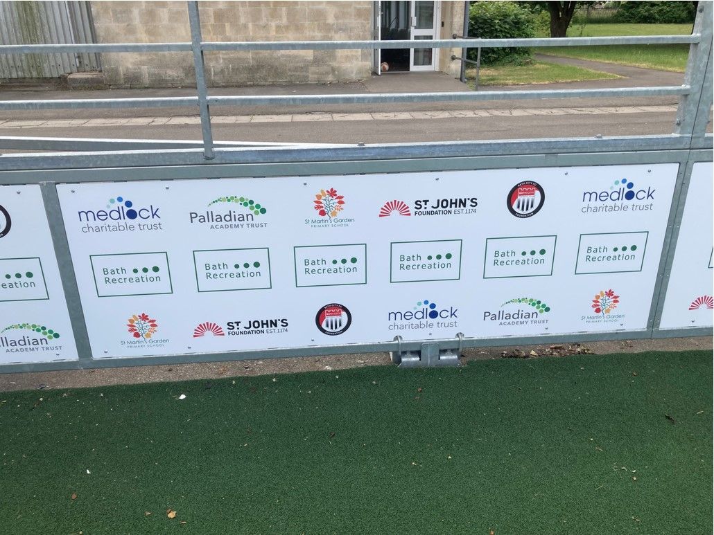
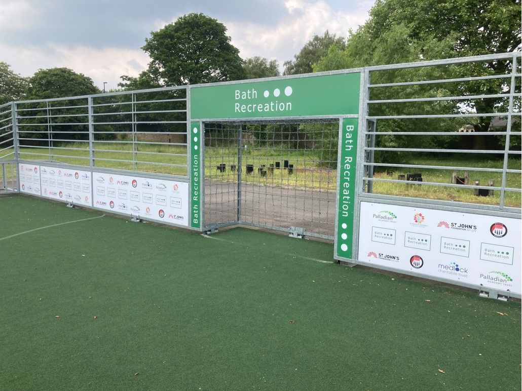
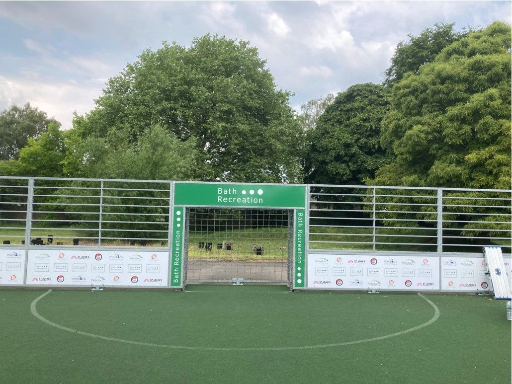
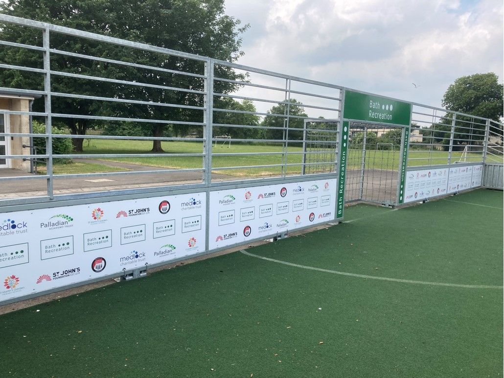
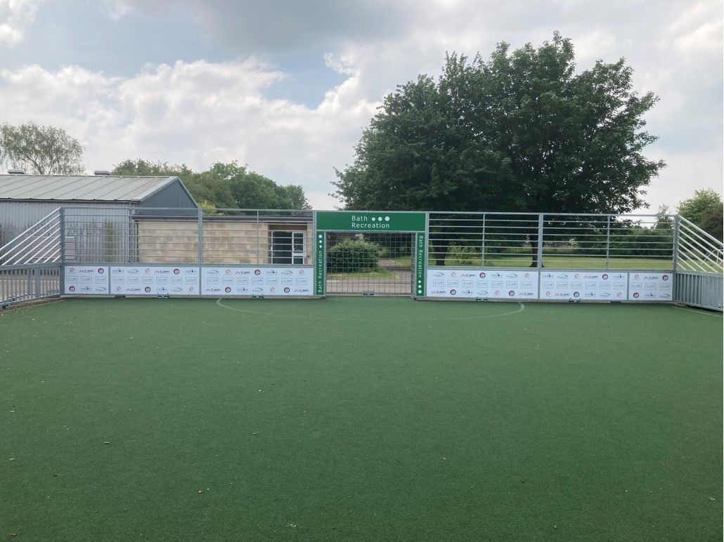
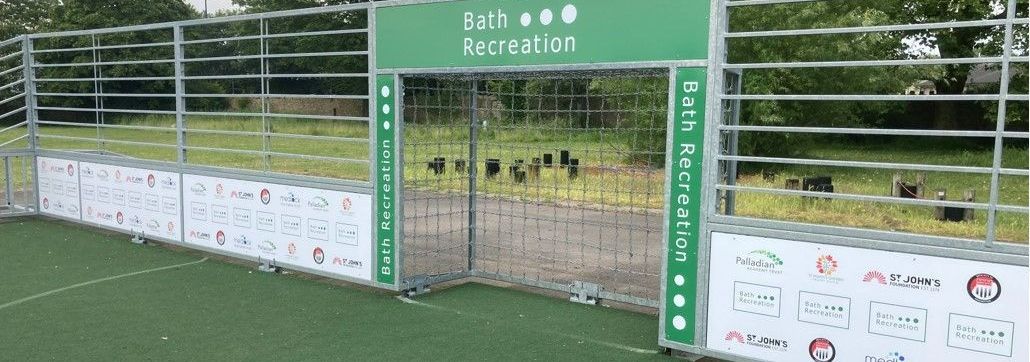
As part of this initiative, we've branded up this multi-use games pitch with the logos of those incredible supporters. It's a visual representation of the unwavering support received and the unity we strive for. Together, these organisations are creating a lasting impact.


A multi-use games pitch is a game-changer for schools. Not only does it provide a versatile space for various sports, but it also offers countless benefits.

First and foremost, it promotes inclusivity, ensuring that students of all abilities can participate and enjoy physical activities together. 

It encourages teamwork, cooperation, and friendly competition, fostering valuable life skills among students. 


With a dedicated space for sports, students can engage in regular physical exercise, leading to improved fitness levels and overall well-being.


Additionally, a multi-use games pitch maximises the utilisation of limited space, allowing schools to offer a wide range of sports without compromising on facilities.

We are grateful to Bath Recreation Limited a there generous supporter for making this vision a reality. Together, they are empowering the youth of Bath and creating a healthier, more active future for all!

Is there an interesting branding project like this that we can help with? Drop us a line for an initial chat.


CONTACT US

ASK US ABOUT

Branding outdoor sports areas


Enquiry Form

SHARE THIS POST

by David Dixon 13 March 2025
Our new 2025 Display Handbook is available now.
N3 Display Graphics | A construction site with a sign that says the total student living experience
by N3 Display Graphics 12 November 2024
Branded hoarding panels are more than just a barrier around a construction site—they’re a canvas for bold, compelling visual communication that transforms your site into a marketing asset. Here’s why branded hoarding adds value: Maximises Visibility and Awareness Hoardings turn idle space into high-impact advertising. Custom graphics can feature project details, architectural renders, and even promotional messages, attracting attention from passersby and generating interest in your development long before completion.
by David Dixon 3 October 2024
We’re excited to share our recent collaboration with Ovo Energy, where we transformed their Bristol headquarters with a sustainable brand refresh. This project blended bold design with eco-friendly materials to reflect Ovo’s commitment to the environment. Striking Exterior and Eco-Friendly Interiors The refresh begins at the entrance, where vibrant green vinyl gives the windows a fresh, bold look. The existing Ovo logo was re-coated in white, creating a welcoming focal point at the reception that reinforces their brand identity and environmental values. Inside, we incorporated printed plywood panels, locally sourced vinyl, and acrylics to create engaging, sustainable design elements throughout the office. Custom logos and lettering crafted from routed and painted plywood added a bespoke, high-quality finish.
Share by: